How To Create Effective Safety Signage
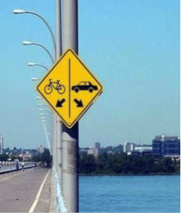
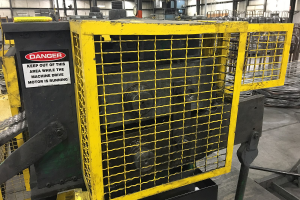
There is good safety signage, bad safety signage and those that don’t tell you anything. An example of a “bad safety signage” is shown to the right. Notice the horrible placement and lack of context on the sign itself.
Historically, the foundation for “good safety signage” contains symbols with few or no words, with the words or symbols being placed so they make sense to a person seeing the sign for the first time.
Other signs suggest that the property owner or organization believes the caution provides some degree of indemnification in the event of an injury. Perhaps it does, but such vague wording provides little in the way of guidance to actually reduce ri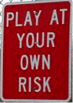 sk. “PLAY AT YOUR OWN RISK” is an example of this type of sign. The sign issues a warning but ultimately parents and children are left to their own best guess as to what might actually cause an injury.
Over the past years, I have performed hundreds of Task Based Risk Assessments (See past blogs for a description of the TaBRA methodology). I would estimate that only 5-10% of identified high risk task elements result from the hazards of machine motion. The vast majority of high risk (a combination of both probability and severity) result from slips/trips/falls, strains and sprains and other hazards not protected by lockout or guarding.
The FDR TaBRA process includes determination of feasible risk reduction for the specific machine and task. Part of that risk reduction typically results in specific words posted at point of use. Workers and floor supervisors who perform training for new workers are the key focus because they typically train other workers on the specifics of how to be safe for a given task(s).
Our question is simple, “If your child was hired into this job, what cautions would assist you in your on-the-job training and improving employee awareness?” The worker provides the final review and “approval” that the words, pictures or symbols and their placement make sense from “the perspective of the worker.”
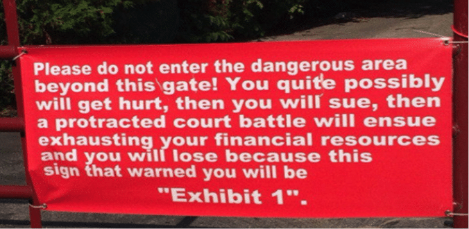
With all of this being said, A truly good sign should not only get someone’s attention but should be useful to defend against OSHA citations or potential legal actions. Regardless of the amount of text or symbols, remember that point of use and clearly stated cautions are key to any safety sign. Below is my idea of a good safety sign.
Mike Taubitz spent many years in top positions at General Motors, including stints as Global Safety Director and Global Regulatory Liaison. He has a strong interest in lean manufacturing and its relationship to safety and in sustainability, and is recognized internationally for his expertise in machine guarding. He assists clients in creating efficient and effective safety programs, especially in manufacturing environments.
For a FREE consultation, please contact us.
